Showing posts with label Effect. Show all posts

Saturday, August 20, 2011

Add Slant Images Effect for Blogger


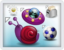
Hi, friends! Now, I will post about an image effect for blogger, thats's Add Slant Images Effect for Blogger. The effect is when you put your cursor on the image (which has added slanted effect), the image will be zooming and slanting at the moment.

  • DEMO - Put your cursor on the picture above


How can I add slant images effect for my blog? Just follow the step below, friend!

1. Log in to your blogger account
2. Go to Design --> Edit HTML
3. Copy the code below, and paste above
.FBT-slant:hover{
-moz-transform:rotate(22.5deg) scale(1.20);
-webkit-transform:rotate(22.5deg) scale(1.20);
}
4. Click

To activate this effect, just use the class. Look at the example code below (the red-code is the class)
<img class="FBT-slant" src=" http://4.bp.blogspot.com/-oQKkFPiX0uo/Tk5rq8E6Z1I/AAAAAAAAAf4/njtG_1q_tSU/s1600/blogger_batik_by_mardee.png" />

OK, thats's all, friend. Hopefully useful...

Saturday, July 16, 2011

Animated Label with jQuery

Did you know, jQuery Link Nudging? Now we will add jQuery Link Nudging in Label. What is the effect? So, when you put your cursor on one of the label, the label will be move to the right. The  You can try in this page (Try on "Labels"). Looks nice right? Now, if you wanna try Animated Label with jQuery, just follow the steps below.

1. Log in to your blogger account
2. Go to Design --> Edit HTML
3. Copy the code below, and paste above </head>
<script src='http://ajax.googleapis.com/ajax/libs/jquery/1.5.1/jquery.min.js' type='text/javascript'>
</script>
<script type='text/javascript'>
var dur = 450;
$(document).ready(function() {
$('a.linknudge, .Label ul li a').hover(function() {
$(this).animate({
paddingLeft: '20px'
}, dur);
}, function() {
$(this).animate({
paddingLeft: 0
}, dur);
});
});</script>
4. Click

So easy right, to add Animated Label with jQuery?

Tuesday, July 5, 2011

Change Image Just with Scroll

Hi, friends! Now, I will post about a trick. That's Change Image Just with Scroll. The effect is when you put  your cursor on the picture and scroll the mousewheel, the picture will be change. Let's see the DEMO. Now if you want to try this trick, just follow the steps below.

1. Log in to your blogger account
2. Go to Design --> Page Elements --> Add gadget
3. Choose "HTML/Java Script"
<img id="slideshow" src="PICTURE-1" />

<script type="text/javascript">
var myimages=[
"PICTURE-1",
"PICTURE-2",
"PICTURE-3",
"PICTURE-4",
"PICTURE-5"
]
var slideshow=document.getElementById("slideshow")
var nextslideindex=0
function rotateimage(e){
var evt=window.event || e
var delta=evt.detail? evt.detail*(-120) : evt.wheelDelta
nextslideindex=(delta<=-120)? nextslideindex+1 : nextslideindex-1
nextslideindex=(nextslideindex<0)? myimages.length-1 : (nextslideindex>myimages.length-1)? 0 : nextslideindex
slideshow.src=myimages[nextslideindex]
if (evt.preventDefault)
evt.preventDefault()
else
return false
}
var mousewheelevt=(/Firefox/i.test(navigator.userAgent))? "DOMMouseScroll" : "mousewheel"

if (slideshow.attachEvent)
slideshow.attachEvent("on"+mousewheelevt, rotateimage)
else if (slideshow.addEventListener)
slideshow.addEventListener(mousewheelevt, rotateimage, false)
</script>
=> You can replace the images that will be change
=> The image of PICTURE-1 must be same with PICTURE-1
4. Click SAVE

OK, that's all friends... Hopefully usefull :D

Sunday, July 3, 2011

Add Floating Spoiler Menu

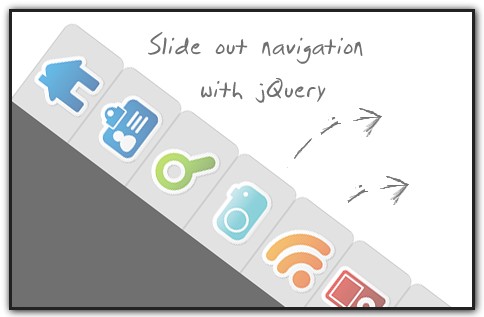
Hi, guys! Now, we will try to add floating spoiler menu. This spoiler menu is difference with others. We don't need to click the button to display the menu. Just put your cursor on this menu, and the menu wil be slide out. Want to see the DEMO? Now, if you wanna add floating spoiler menu into your blog, just follow the steps below.

1. Log in to your blogger account
2. Go to Design --> Page Elements --> Add Gadget
3. Chose "HTML/Java Script"
4. Add the code below
<style text-type="CSS">
#bmenu{
position:fixed;
right:5px;
center:0px;
background-color:#000;
border-radius:10px;
-moz-border-radius:10px;
border:1px solid #FFF;
width:202px;
height:20px;
color:#FF0606;
transition:all .5s ease-in;-moz-transition:all .5s ease-in;-webkit-transition:all .5s ease-in;-o-transition:all .5s ease-in;z-index:3;overflow:hidden;padding:9px 15px 10px;}

#bmenu h3{
margin:0;
padding:0;
text-align:center;
cursor:pointer;}

#bmenu ul{
border-radius:10px;-moz-border-radius:10px;
border:2px solid #FFf;
background-color:#FF0606;
margin:15px 0;
padding:0 15px;}

#bmenu li{list-style:none;margin:0 0 5px;padding:0;} #bmenu li a{
color:#000;
text-decoration:none;
font-size:14px;}

#bmenu li a:hover{
color:#fff;}

#bmenu:hover{
z-index:5;
height:175px;
</style>

<div id="bmenu">
<h3>
TITLE</h3>
<ul>
<li><a href="#">FBT-1</a></li>
<li><a href="#">FBT-2</a></li>
<li><a href="#">FBT-3</a></li>
<li><a href="#">FBT-4</a></li>
<li><a href="#">FBT-5</a></li>
</ul>
</div>
Customize:
=> The position of floating spoiler menu
=> The title of this menu
=> The title and link location

5. Click SAVE

Sunday, June 26, 2011

Magic Image! Move Image Freely

Hi, friends! Now, we are gonna make a crazy trick. That's Magic Image! Move Image Freely. Freely? Yups... you and your visitors of your blog can move images wherever. Left, right, top, or bottom. It's up to you. Curious? See the DEMO. OK, now if you wanna try Magic Image! Move Image Freely, just follow the steps below.

1. Log in to your blogger icon
2. Go to Design --> Edit HTML
3. Copy the code below, and paste above ]]></b:skin>
.FBT_magic img { cursor: move;}
4. Then, copy the code below and paste above </head>
<script src='http://ajax.googleapis.com/ajax/libs/jquery/1.4/jquery.min.js' type='text/javascript'/>
<script src='http://ajax.googleapis.com/ajax/libs/jqueryui/1.8/jquery-ui.min.js' type='text/javascript'/>
<script type='text/javascript'>
$(document).ready(function() {
$(&quot;div.FBT_magic img&quot;).draggable();
});
</script>
5. Click SAVE TEMPLATE

Now if you wanna use this effect, just use this code
<div class='FBT_magic'><img src='PICTURE-URL'/></div>

OK, That's all friend... Hopefully useful...

Thursday, June 16, 2011

Glowing Navigation Menu with jQuery for Blogger

Hi guys! Today, we will try to create Glowing Navigation Menu with jQuery for Blogger. Maybe this trick is almost similar with Hide Show Social Bookmarks with Hover. But, I think Glowing Navigation is better. Want to see the DEMO? OK, now if you want to try Glowing Navigation Menu with jQuery for Blogger, just follow the steps below.

1. Log in to your blogger account
2. Go to Design --> Editt HTML
3. Copy the code below, and paste above ]]></b:skin>

.kwicks{height:50px;list-style:none;margin:0;padding:0;position:relative;width:840px;z-index:2
}
.kwicks li{cursor:pointer;display:block;float:left;height:50px;overflow:hidden;padding:0;width:120px;z-index:2}
.kwicks li a{background-image:url(http://4.bp.blogspot.com/-e1c5hdvd0MQ/TbgSHi-7EEI/AAAAAAAAAzs/Y9aTBHEgh84/s1600/menu%2Bjquery%2Bpelajaran%2Bblog.jpg
);background-repeat:no-repeat;cursor:pointer;display:block;height:50px;outline:none;text-indent:-9999px;z-index:2}
#kwick1 a:hover{background-position:0 -50px!important}
#kwick2 a{background-position:-190px 0}
#kwick2 a:hover{background-position:-190px -50px!important}
#kwick3 a{background-position:-380px 0}
#kwick3 a:hover{background-position:-380px -50px!important}
#kwick4 a{background-position:-570px 0}
#kwick4 a:hover{background-position:-570px -50px!important}
#kwick5 a{background-position:-760px 0}
#kwick5 a:hover{background-position:-760px -50px!important}
#kwick6 a{background-position:-950px 0}
#kwick6 a:hover{background-position:-950px -50px!important}
.kwicks li ul a{float:left;width:12em}
.kwicks ul ul{top:auto}
.kwicks li ul ul{left:12em;margin:0 0 0 10px}
.kwicks li:hover ul,#nav li li:hover ul,#nav li li li:hover ul,#nav li li li li:hover ul{display:block
}

4. Then copy the code  below, and paste above </head>
<script src='http://pelajarandashblogdotblogspotdotcom.googlecode.com/files/jquery-1.2.3.js' type='text/javascript'/>
<script src='http://pelajarandashblogdotblogspotdotcom.googlecode.com/files/jquery.kwicks-1.5.1.js' type='text/javascript'/>
<script src='http://pelajarandashblogdotblogspotdotcom.googlecode.com/files/jquery.easing.1.3.js' type='text/javascript'/>
5. Click SAVE TEMPLATE
6. Now, go to Design --> Page Elements --> Add Gadget, choose "HTML/Java Script"
7. After that, add this code
<div class='kwickswrap'>
<ul class='kwicks'>
<li id='kwick1'><a href='#' title='Home'>Home</a></li>
<li id='kwick2'><a href='#' title='Contents'>Blog</a></li>
<li id='kwick3'><a href='#' title='About'>About</a></li>
<li id='kwick4'><a href='#' title='Futures'>Portfolio</a></li>
<li id='kwick5'><a href='#' title='Contact us'>Contact</a></li>
<li id='kwick6'><a href='#' title='Recomended links'>Resource</a></li>
</ul>
</div>
</td>
<script type="text/javascript">
$().ready(function() {
$('.kwicks').kwicks({
max : 190,
duration: 800,
easing: 'easeOutQuint'
});
});
</script>
=> You have to customize the URL first
8. Click SAVE

Tuesday, May 31, 2011

Simple Fog Effect for Blogger Image

Maybe you are boring with the image on your blog. Because the image does't has any effect. Now we will add some effect to your image. That's Simple Fog Effect for Blogger Image. Usually fog effect can be called with "Blur". The effect is when you put your cursor on the image, the image will be foggy. See the demo

blogger icon


Nice right? OK, if you want to try Simple Fog Effect for Blogger Image, just follow the steps below.

1. Log in to your blogger icon
2. Go to Design --> Edit HTML
3. Copy the code below, and paste above ]]></b:skin>
.FBT-blur img {filter:alpha(opacity=100); -moz-opacity:1.0; opacity:1.0; border:0;}
.FBT-blur:hover img {filter:alpha(opacity=30); -moz-opacity:0.3; opacity:0.3;border:0;}
4. Click SAVE TEMPLATE

Then to "call" the effect just add some code, so the image code will be like this
<a class="FBT-blur" href="http://full-tricks.blogspot.com/"><img alt="blogger icon" border="0" src="http://3.bp.blogspot.com/-a0b5TxNurp8/TeW6QAGDFVI/AAAAAAAAAaU/MBH8_54AreY/s200/fullblogtricks-blogger-icon.jpg" /></a>

So easy right?

Saturday, May 28, 2011

Create Curved Objects on Blog

Have you see a curved object on my blog? Like this...
Full Blog Tricks
Above is one of the variations of curved objects or can be called "BORDER-RADIUS". With border-radius, our blog will look flexible. Unfortunately, border-radius can't support on Internet Explore. Now, we will learn and try to create curved objects on blog. The curved objects are separated by the browser.

Mozilla Firefox
<div style="background-color:#ccc; -moz-border-radius:5px; border:1px solid #000; padding:10px;">FULL BLOG TRICKS</div>

<div style="background-color:#ccc; -moz-border-radius-topleft:10px; -moz-border-radius-topright:10px; border:1px solid #000; padding:10px;">FULL BLOG TRICKS</div>

<div style="background-color:#F5F6CE; -moz-border-radius-topright:30px; -moz-border-radius-bottomright:30px; border:5px solid #000; padding:10px;">FULL BLOG TRICKS</div>

Safari
<div style="background-color:#A9D0F5; -webkit-border-top-left-radius:30px; -webkit-border-bottom-right-radius:30px; border:5px solid #38610B; padding:10px;">FULL BLOG TRICKS</div>

<div style="background-color:#F5D0A9; -webkit-border-top-left-radius:50px; -webkit-border-top-right-radius:50px; border:5px solid #38610B; padding:10px;">FULL BLOG TRICKS</div>

Opera 10.5
<div style="background-color:#F5F6CE; border-radius:30px; border:5px solid #38610B; padding:10px;">FULL BLOG TRICKS</div>

OK, that's all friend. Hopefully useful...

Friday, May 27, 2011

Meteor Shower on My Blog!!!

Now, we will try to make an effect. That's Meteor Shower on My Blog. This effect is very interesting. When you open your blog (has added this effect) you blog will be get meteor shower. Very nice right? OK, now if you want to add meteor shower on your blog, just follow the steps below. Want to see the DEMO?

1. Log in to your blogger account
2. Go to Design --> Page Elements --> Add Gadget
3. Choose "HTML/Java Script"
4. Then, add the code below
<script language="javascript">
nd_mode="meteor";
nd_sound="on";
nd_vAlign="bottom";
nd_hAlign="right";
nd_vMargin="10";
nd_hMargin="10";
nd_target="_top";
</script>
<script language="javascript" src="http://www.netdisaster.com/js/mynd.js">
</script>
5. Click SAVE

Thursday, May 19, 2011

Moving Down Background for Blogger

Now, I will share about Moving Down Background for Blogger. This trick is very unique. Why? Because the blog background will move without scrolling. So I called this "Unique Background". Want to see the DEMO? OK, now if you want to try Moving Down Background for Blogger, just follow the steps below.

1. Log in to your blogger account
2. Go to Design --> Edit HTML
3. Copy the code below, and paste above </head>

<script src='http://ajax.googleapis.com/ajax/libs/jquery/1.3.2/jquery.min.js?ver=1.3.2' type='text/javascript'></script>
<script type='text/javascript'>
//<![CDATA[
$(function(){

// ***
// Scrolling background
// ***

// height of background image in pixels
var backgroundheight = 4000;

// get the current minute/hour of the day
var now = new Date();
var hour = now.getHours();
var minute = now.getMinutes();

// work out how far through the day we are as a percentage - e.g. 6pm = 75%
var hourpercent = hour / 24 * 100;
var minutepercent = minute / 30 / 24 * 100;
var percentofday = Math.round(hourpercent + minutepercent);

// calculate which pixel row to start graphic from based on how far through the day we are
var offset = backgroundheight / 100 * percentofday;

// graphic starts at approx 6am, so adjust offset by 1/4
var offset = offset - (backgroundheight / 1);

function scrollbackground() {
// decrease the offset by 1, or if its less than 1 increase it by the background height minus 1
offset = (offset < 1) ? offset + (backgroundheight - 1) : offset - 1;
// apply the background position
$('body').css("background-position", "50% " + offset + "px");
// call self to continue animation
setTimeout(function() {
scrollbackground();
}, 70
);
}

// Start the animation
scrollbackground();
});
//]]>
</script>

4. Then try to find
body {
just copy this code and put under body {
background:url(http://lh6.ggpht.com/_dfnTVAxeWMI/SrFV2ZgHUvI/AAAAAAAACU8
/yP_7acjnv5U/bgscroll.jpg);
5. Click SAVE TEMPLATE

Tuesday, May 10, 2011

Shadow and Text Hover Effect to Image

Hi guys! Thank you for your visit. Have you hear about hover effect? Hover effect is an affect that active when you put your cursor on an object, for example an image. Effect that produced are so many. For example Shadow and Text Hover Effect to Image. I will give the demo.


Blogger tricks, hacks, widgets.


Interested? To know the steps, just follow the steps below.

1. Log in to your blogger account
2. Go to Design --> Edit HTML
3. Copy the code below, and paste above ]]></b:skin>

#image-hover {
}

#figure {
position:relative;
float:left;
margin:10px;
overflow:hidden;
padding: 1px;
}

#figure:hover {
-moz-box-shadow:0 0 20px rgba(0,0,0,0.75);
-webkit-box-shadow:0 0 20px rgba(0,0,0,0.75);
box-shadow:0 0 20px rgba(0,0,0,0.75);
}

#figure .caption {
position:absolute;
bottom:0;
left:0;
opacity: 0.75;
margin-bottom:-115px;
-webkit-transition: margin-bottom;
-webkit-transition-duration: 400ms;
-webkit-transition-timing-function: ease-out;
-moz-transition-property: margin-bottom;
-moz-transition-duration: 400ms;
-moz-transition-timing-function: ease-out;
-o-transition-property: margin-bottom;
-o-transition-duration: 400ms;
transition: margin-bottom;
transition-duration: 400ms;
transition-timing-function: ease-out;
}

#figure:hover .caption {
margin-bottom:0px;
}

#image-hover .caption {
width:100%;
height:90px;
padding:10px;
background:#B1D7F0;
color:#B1D7F0;
font-family: Arial, Helvetica, sans-serif;
}

#image-hover .caption b {
text-shadow: 0px 2px 0px #B1D7F0;
}
#image-hover .caption {
color: #000000;
line-height: 24px;
font-size: 14px;
text-shadow: 0px 2px 0px #000;
}

4. Then, to active the hover effect, just use this code below
<div id="image-hover">
<div id='figure'>
<a href="http://full-tricks.blogspot.com/" target="_blank">
<img src="http://1.bp.blogspot.com/-ycrEcnVzJAs/TcXGWwcjL3I/AAAAAAAAAYQ/MiQNmK44ZOg/s200/fullblogtricks-blogger-icon.jpg"></a>
<span class='caption'>
Blogger tricks, hacks, widgets
</span></div></div>
=> Replace the red code with your link
=> Replace the blue code with your image URL
=> Replace the orange code with your image text

Good Luck... ^_^

Saturday, May 7, 2011

Add Zoom Hover Effect to Image

Hi friends! Maybe you've heard about How to Add Drop Shadows Effect to Images. Now, we will make new effect. That's Add Zoom Hover Effect to Image. Shortly, when you put your cursor on an image, the image will be zoom (larger). Do you want to try the demo? OK, this is it. And if you want to know how to make the effect, just follow the steps below.
1. Log in to your blogger account
2. Go to Design --> Edit HTML
3. Copy the code below, and paste above ]]></b:skin>
.hovergallery img{
-webkit-transform:scale(0.8);
-moz-transform:scale(0.8);
-o-transform:scale(0.8);
-webkit-transition-duration: 0.5s;
-moz-transition-duration: 0.5s;
-o-transition-duration: 0.5s;
opacity: 0.7;
margin: 0 10px 5px 0;
}

.hovergallery img:hover{
-webkit-transform:scale(1.1);
-moz-transform:scale(1.1);
-o-transform:scale(1.1);
opacity: 1;
}
4. Then if you want to active the effect, use this code
<a class="hovergallery" href="http://full-tricks.blogspot.com/" target="_blank">
<img src="http://1.bp.blogspot.com/-ycrEcnVzJAs/TcXGWwcjL3I/AAAAAAAAAYQ/MiQNmK44ZOg/s200/fullblogtricks-blogger-icon.jpg" /></a>
=> Replace the blue code with your link
=> Replace the red code with image URL

5. Finish... Hopefully useful... ^_^

Friday, January 7, 2011

How To Make A Slide Menu

Hi, Blogger! Now, I will teach you, about How To Make A Slide Menu. Maybe you don't know, what is Slide Menu? Directly, I will give you the example of Slide Menu here. So, if you want to add this menu to your blog, you have to follow the steps.

1. Log in to your blogger account
2. Go to Design --> Page Elements --> Add Gadget
3. Choose HTML/Java Script
4. Add the code below into the place
<style type="text/css">
#hitsukeFX{
position:fixed;
top:150px;
z-index:+1000;
}
.hitsukeFXtab{
 height:100px;
 width:30px; float:left;
 cursor:pointer;
 background:url('http://lh3.ggpht.com/_KdeVdQg2Vsw/Swj9uvNEeVI
/AAAAAAAAAGs/N5XIUu3ymzY/tabs.png') no-repeat;
 }

.hitsukeFXcontent{ float:left;
border:2px solid #A5BD51;
background:#F5F5F5;
padding:10px;
}

</style> <script type="text/javascript">
function showHidehitsukeFX(){
var hitsukeFX = document.getElementById("hitsukeFX");
 var w = hitsukeFX.offsetWidth;
 hitsukeFX.opened ? movehitsukeFX(0, 30-w) : movehitsukeFX(20-w, 0);
 hitsukeFX.opened = !hitsukeFX.opened;
 }

function movehitsukeFX(x0, xf){ var hitsukeFX = document.getElementById("hitsukeFX"); var dx = Math.abs(x0-xf) > 10 ? 5 : 1; var dir = xf>x0 ? 1 : -1; var x = x0 + dx * dir; hitsukeFX.style.right = x.toString() + "px"; if(x0!=xf){setTimeout("movehitsukeFX("+x+", "+xf+")", 10);} }


</script>
<div id="hitsukeFX"> <div class="hitsukeFXtab" onclick="showHidehitsukeFX()"> </div>
 <div class="hitsukeFXcontent">

 <!-- PUT YOUR CODE HERE -->

 </div>
 </div>
 </div>

 <script type="text/javascript"> var hitsukeFX = document.getElementById("hitsukeFX"); hitsukeFX.style.right = (40-hitsukeFX.offsetWidth).toString() + "px"; </script>
*You must change <!-- PUT YOUR CODE HERE --> with your widget code
*The blue code is the image address

5. Then...Save it!

Saturday, January 1, 2011

How To Change Cursor In Blog

Are you bored with default cursor in your blog? If you're bored, you can change the cursor now, easy right? What? You don't know how to change it? OK, i will teach you how to change the cursor. You just follow the steps below.

1. Log in to your blogger account
2. Go to Design>>>Page Elements>>>Add Gadget
3. Choose "HTML/Java Script"
4. Copy the code below, and paste on the place.
<style type="text/css">body
{cursor:url("http://cursors0.totallyfreecursors.com/thumbnails/indonesia.gif"),default}
</style>
5. Save it now

You can change http://cursors0.totallyfreecursors.com/thumbnails/indonesia.gif with your image (cusor) URL. Below are the examples of unique cursor :

http://cursors0.totallyfreecursors.com/thumbnails/aliendance.gif
http://cursors2.totallyfreecursors.com/thumbnails/pool8spin.gif
http://cursors2.totallyfreecursors.com/thumbnails/choco1.gif
http://cursors3.totallyfreecursors.com/thumbnails/bigboo.gif
http://cursors0.totallyfreecursors.com/thumbnails/mario.gif

Friday, December 24, 2010

How To Make A Word To Follow Cursor

OK, if in the previous I have posted How To Make A Clock And Calendar To Follow The Cursor , now i  will post How To Make A Word To Follow Cursor. The effect will make your text around the cursor. Now i wil give the steps.

1. Log in to your blogger account
2. Go to Desgin>>>Page Elements>>>Add Gadget
3. Choose "HTML/Java Script"
4. Then copy the code below, and paste in the place

<style type='text/css'>
#outerCircleText {
font-style: italic;
font-weight: bold;
font-family: 'comic sans ms', verdana, arial;
color: #0000ff;
position: absolute;top: 0;left: 0;z-index: 3000;cursor: default;}
#outerCircleText div {position: relative;}
#outerCircleText div div {position: absolute;top: 0;left: 0;text-align: center;}
</style>

<script type='text/javascript'>
//<![CDATA[
;(function(){
// Your message here (QUOTED STRING)
var msg = "Comments";
/* THE REST OF THE EDITABLE VALUES BELOW ARE ALL UNQUOTED NUMBERS */
// Set font's style size for calculating dimensions
// Set to number of desired pixels font size (decimal and negative numbers not allowed)
var size =20;
// Set both to 1 for plain circle, set one of them to 2 for oval
// Other numbers & decimals can have interesting effects, keep these low (0 to 3)
var circleY = 0.75; var circleX = 2;
// The larger this divisor, the smaller the spaces between letters
// (decimals allowed, not negative numbers)
var letter_spacing = 5;
// The larger this multiplier, the bigger the circle/oval
// (decimals allowed, not negative numbers, some rounding is applied)
var diameter = 10;
// Rotation speed, set it negative if you want it to spin clockwise (decimals allowed)
var rotation = 0.4;
// This is not the rotation speed, its the reaction speed, keep low!
// Set this to 1 or a decimal less than one (decimals allowed, not negative numbers)
var speed = 0.3;
////////////////////// Stop Editing //////////////////////
if (!window.addEventListener && !window.attachEvent || !document.createElement) return;
msg = msg.split('');
var n = msg.length - 1, a = Math.round(size * diameter * 0.208333), currStep = 20,
ymouse = a * circleY + 20, xmouse = a * circleX + 20, y = [], x = [], Y = [], X = [],
o = document.createElement('div'), oi = document.createElement('div'),
b = document.compatMode && document.compatMode != "BackCompat"? document.documentElement
:
document.body,
mouse = function(e){
e = e || window.event;
ymouse = !isNaN(e.pageY)? e.pageY : e.clientY; // y-position
xmouse = !isNaN(e.pageX)? e.pageX : e.clientX; // x-position
},
makecircle = function(){ // rotation/positioning
if(init.nopy){
o.style.top = (b || document.body).scrollTop + 'px';
o.style.left = (b || document.body).scrollLeft + 'px';
};
currStep -= rotation;
for (var d, i = n; i > -1; --i){ // makes the circle
d = document.getElementById('iemsg' + i).style;
d.top = Math.round(y[i] + a * Math.sin((currStep + i) / letter_spacing) * circleY - 15) +
'px';
d.left = Math.round(x[i] + a * Math.cos((currStep + i) / letter_spacing) * circleX) + 'px';
};
},
drag = function(){ // makes the resistance
y[0] = Y[0] += (ymouse - Y[0]) * speed;
x[0] = X[0] += (xmouse - 20 - X[0]) * speed;
for (var i = n; i > 0; --i){
y[i] = Y[i] += (y[i-1] - Y[i]) * speed;
x[i] = X[i] += (x[i-1] - X[i]) * speed;
};
makecircle();
},
init = function(){ // appends message divs, & sets initial values for positioning arrays
if(!isNaN(window.pageYOffset)){
ymouse += window.pageYOffset;
xmouse += window.pageXOffset;
} else init.nopy = true;
for (var d, i = n; i > -1; --i){
d = document.createElement('div'); d.id = 'iemsg' + i;
d.style.height = d.style.width = a + 'px';
d.appendChild(document.createTextNode(msg[i]));
oi.appendChild(d); y[i] = x[i] = Y[i] = X[i] = 0;
};
o.appendChild(oi); document.body.appendChild(o);
setInterval(drag, 25);
},
ascroll = function(){
ymouse += window.pageYOffset;
xmouse += window.pageXOffset;
window.removeEventListener('scroll', ascroll, false);
};
o.id = 'outerCircleText'; o.style.fontSize = size + 'px';
if (window.addEventListener){
window.addEventListener('load', init, false);
document.addEventListener('mouseover', mouse, false);
document.addEventListener('mousemove', mouse, false);
if (/Apple/.test(navigator.vendor))
window.addEventListener('scroll', ascroll, false);
}
else if (window.attachEvent){
window.attachEvent('onload', init);
document.attachEvent('onmousemove', mouse);
};
})();
//]]>
</script>

NOTE : #0000ff with your color choice
             Comments with your message

5. If finished, save it now

Friday, December 17, 2010

How To Make A Clock And Calendar To Follow The Cursor

Give star effect on the cursor? That's usual. Change the cursor with another icon? Easy. If, make a clock and calendar to follow the cursor? It's amazing. Maybe this trick is rarely found on other blogs, but to give thebest for readers, we are ready to post a rare trick. Directly, if you want to try this trick, just follow the steps below.

1. Log in to your blogger account
2. Go to Design>>>Page Elements>>>Add Gadget
3. Choose HTML/Java Script
4. Get the HTML code
5. Copy and paste in the place
6. Save it

How To Set Marquee Effect (Running Text) In Title Bar

Now, many people like marquee effect. They like it because marquee are simple and attractive widget. Usually they put the marquee in the sidebar. But, I will teach you how to put it on the Title Bar. By the way, do you know Title Bar? Title Bar is a tab which contain the name of the page.
OK if you already know Title Bar, you can learn it by following the steps below

1. Log in to your blogger account
2. Go to Design>>>Edit HTML
3. Find this code : </head>
4. Copy the code below

<script type='text/javascript'>
//<![CDATA[
function tb9_makeArray(n){
this.length = n;
return this.length;
}
tb9_messages = new tb9_makeArray(1);
tb9_messages[0] = "Welcome To My Blog";
tb9_rptType = 'infinite';
tb9_rptNbr = 5;
tb9_speed = 100;
tb9_delay = 2000;
var tb9_counter=1;
var tb9_currMsg=0;
var tb9_timerID = null
var tb9_bannerRunning = false
var tb9_state = ""
tb9_clearState()
function tb9_stopBanner() {
if (tb9_bannerRunning)
clearTimeout(tb9_timerID)
tb9_timerRunning = false
}
function tb9_startBanner() {
tb9_stopBanner()
tb9_showBanner()
}
function tb9_clearState() {
tb9_state = ""
for (var i = 0; i < tb9_messages[tb9_currMsg].length; ++i) {
tb9_state += "0"
}
}
function tb9_showBanner() {
if (tb9_getString()) {
tb9_currMsg++
if (tb9_messages.length <= tb9_currMsg) {
if ((tb9_rptType == 'finite') && (tb9_counter==tb9_rptNbr)){
tb9_stopBanner();
return;
}
tb9_counter++;
tb9_currMsg=0;
}
tb9_clearState()
tb9_timerID = setTimeout("tb9_showBanner()", tb9_delay)
}
else {
var tb9_str = ""
for (var j = 0; j < tb9_state.length; ++j) {
tb9_str += (tb9_state.charAt(j) == "1") ? tb9_messages[tb9_currMsg].charAt(j) : "____"
}
document.title = tb9_str
tb9_timerID = setTimeout("tb9_showBanner()", tb9_speed)
}
}
function tb9_getString() {
var full = true
for (var j = 0; j < tb9_state.length; ++j) {
if (tb9_state.charAt(j) == 0)
full = false
}
if (full) return true
while (1) {
var num = tb9_getRandom(tb9_messages[tb9_currMsg].length)
if (tb9_state.charAt(num) == "0")
break
}
tb9_state = tb9_state.substring(0, num) + "1" + tb9_state.substring(num + 1, tb9_state.length)
return false
}
function tb9_getRandom(max) {
var now = new Date()
var num = now.getTime() * now.getSeconds() * Math.random()
return num % max
}
tb9_startBanner()

//]]>
</script>


5. Paste above </head>
6. Save it

NOTE : Change the red words with your message (Welcome To My Blog)

Thursday, December 16, 2010

How To Make A Marquee Effect (Running Text) In Blog

What is marquee? Marquee is a HTML program to make a running/moving text. Many people like this, because by wearing marquee in our blog, the blog will be attractive. Before I tell how to make it, it's better for you to know some HTML code in marquee.

Marquee can be made with tag <marquee>. . .</marquee>


bgcolor="color" (set the background color)

direction="left/right/up/down" (set the direction)

behavior="scroll/side/alternate" (set the characteristic of text)

tittle="message" (your message that will be display)

scrollamount="number" (set the speed of text)

scrolldelay="number" (set the delay time)

loop="number" (set the number of loops)

width="number" (set the width of text background)

height="number" (set the height of text background)

NOTE : Change the blue word

Confuse? I give you some examples, see below

<marquee align="center" direction="right" height="70" scrollamount="2" width="100%">
Give us a comment
</marquee>

Give us a comment


<marquee align="center" direction="left" height="70" scrollamount="3" width="100%" behavior="alternate">
Follow us
</marquee>

Follow us


<marquee bgcolor="RED" width="100%" scrollamount="3" behavior="alternate">
Get many tricks for your blog
</marquee>

Get many tricks for your blog


<marquee onmouseover="this.stop( ) " onmouseout="this.start ( ) " scrollamount="2" drection="up" width="100%" height="100" align="center">
Follow us
</marquee>
Follow us


For another marquee effect, you can change the HTML code and make your own attractive marquee effect!

Saturday, December 11, 2010

How to Add Rainbow Effect For Link And Post Title

Usually when we moved our cursor to the post title, the color on the title will change. But the change is only one color. Therefore, I will teach you how to change the color into Rainbow Effect. So, if you want to learn it, just follow the steps below.

1. Log in to your blogger account
2. Go to Design>>>Edit HTML
3. Find this code : </head>
3. Then copy the code below


<script type='text/javascript'>


 //<![CDATA[


 var rate = 20;


 if (document.getElementById)
  window.onerror=new Function("return true")


 var objActive;  // The object which event occured in
  var act = 0;    // Flag during the action
  var elmH = 0;   // Hue
  var elmS = 128; // Saturation
  var elmV = 255; // Value
  var clrOrg;     // A color before the change
  var TimerID;    // Timer ID


 if (document.all) {
  document.onmouseover = doRainbowAnchor;
  document.onmouseout = stopRainbowAnchor;
  }
  else if (document.getElementById) {
  document.captureEvents(Event.MOUSEOVER | Event.MOUSEOUT);
  document.onmouseover = Mozilla_doRainbowAnchor;
  document.onmouseout = Mozilla_stopRainbowAnchor;
  }


 function doRainbow(obj)
  {
  if (act == 0) {
  act = 1;
  if (obj)
  objActive = obj;
  else
  objActive = event.srcElement;
  clrOrg = objActive.style.color;
  TimerID = setInterval("ChangeColor()",100);
  }
  }


 function stopRainbow()
  {
  if (act) {
  objActive.style.color = clrOrg;
  clearInterval(TimerID);
  act = 0;
  }
  }


 function doRainbowAnchor()
  {
  if (act == 0) {
  var obj = event.srcElement;
  while (obj.tagName != 'A' && obj.tagName != 'BODY') {
  obj = obj.parentElement;
  if (obj.tagName == 'A' || obj.tagName == 'BODY')
  break;
  }


 if (obj.tagName == 'A' && obj.href != '') {
  objActive = obj;
  act = 1;
  clrOrg = objActive.style.color;
  TimerID = setInterval("ChangeColor()",100);
  }
  }
  }


 function stopRainbowAnchor()
  {
  if (act) {
  if (objActive.tagName == 'A') {
  objActive.style.color = clrOrg;
  clearInterval(TimerID);
  act = 0;
  }
  }
  }


 function Mozilla_doRainbowAnchor(e)
  {
  if (act == 0) {
  obj = e.target;
  while (obj.nodeName != 'A' && obj.nodeName != 'BODY') {
  obj = obj.parentNode;
  if (obj.nodeName == 'A' || obj.nodeName == 'BODY')
  break;
  }


 if (obj.nodeName == 'A' && obj.href != '') {
  objActive = obj;
  act = 1;
  clrOrg = obj.style.color;
  TimerID = setInterval("ChangeColor()",100);
  }
  }
  }


 function Mozilla_stopRainbowAnchor(e)
  {
  if (act) {
  if (objActive.nodeName == 'A') {
  objActive.style.color = clrOrg;
  clearInterval(TimerID);
  act = 0;
  }
  }
  }


 function ChangeColor()
  {
  objActive.style.color = makeColor();
  }


 function makeColor()
  {
  // Don't you think Color Gamut to look like Rainbow?


 // HSVtoRGB
  if (elmS == 0) {
  elmR = elmV;    elmG = elmV;    elmB = elmV;
  }
  else {
  t1 = elmV;
  t2 = (255 - elmS) * elmV / 255;
  t3 = elmH % 60;
  t3 = (t1 - t2) * t3 / 60;


 if (elmH < 60) {
  elmR = t1;  elmB = t2;  elmG = t2 + t3;
  }
  else if (elmH < 120) {
  elmG = t1;  elmB = t2;  elmR = t1 - t3;
  }
  else if (elmH < 180) {
  elmG = t1;  elmR = t2;  elmB = t2 + t3;
  }
  else if (elmH < 240) {
  elmB = t1;  elmR = t2;  elmG = t1 - t3;
  }
  else if (elmH < 300) {
  elmB = t1;  elmG = t2;  elmR = t2 + t3;
  }
  else if (elmH < 360) {
  elmR = t1;  elmG = t2;  elmB = t1 - t3;
  }
  else {
  elmR = 0;   elmG = 0;   elmB = 0;
  }
  }


 elmR = Math.floor(elmR).toString(16);
  elmG = Math.floor(elmG).toString(16);
  elmB = Math.floor(elmB).toString(16);
  if (elmR.length == 1)    elmR = "0" + elmR;
  if (elmG.length == 1)    elmG = "0" + elmG;
  if (elmB.length == 1)    elmB = "0" + elmB;


 elmH = elmH + rate;
  if (elmH >= 360)
  elmH = 0;


 return '#' + elmR + elmG + elmB;
  }


 //]]>


 </script>


7. And paste it above </head>
8. Save and try it

Tuesday, November 16, 2010

Star Effect On the Cursor

Hi, my loyal reader. A few days ago, I found a new trick. This tricks is work if you move the cursor, so the cursor will drop a lot of stars. So you can see falling star in your blog, and your blog will be sparkle. OK if you think this trick is nice, just follow the steps below

1. Log in to your Blogger  Account
2. Go to Design>>>Edit HTML
3. Find code : </body> (If you want to faster : F3)
4. Copy and paste the code below AFTER that
5. Save and then see your sparkle blog!